
The Online Writing Instrument Magazine -
Wearever De Luxe "Mother of Pearl" c1940-1943
by Jim Mamoulides, June 11, 2003, updated June 12, 2016
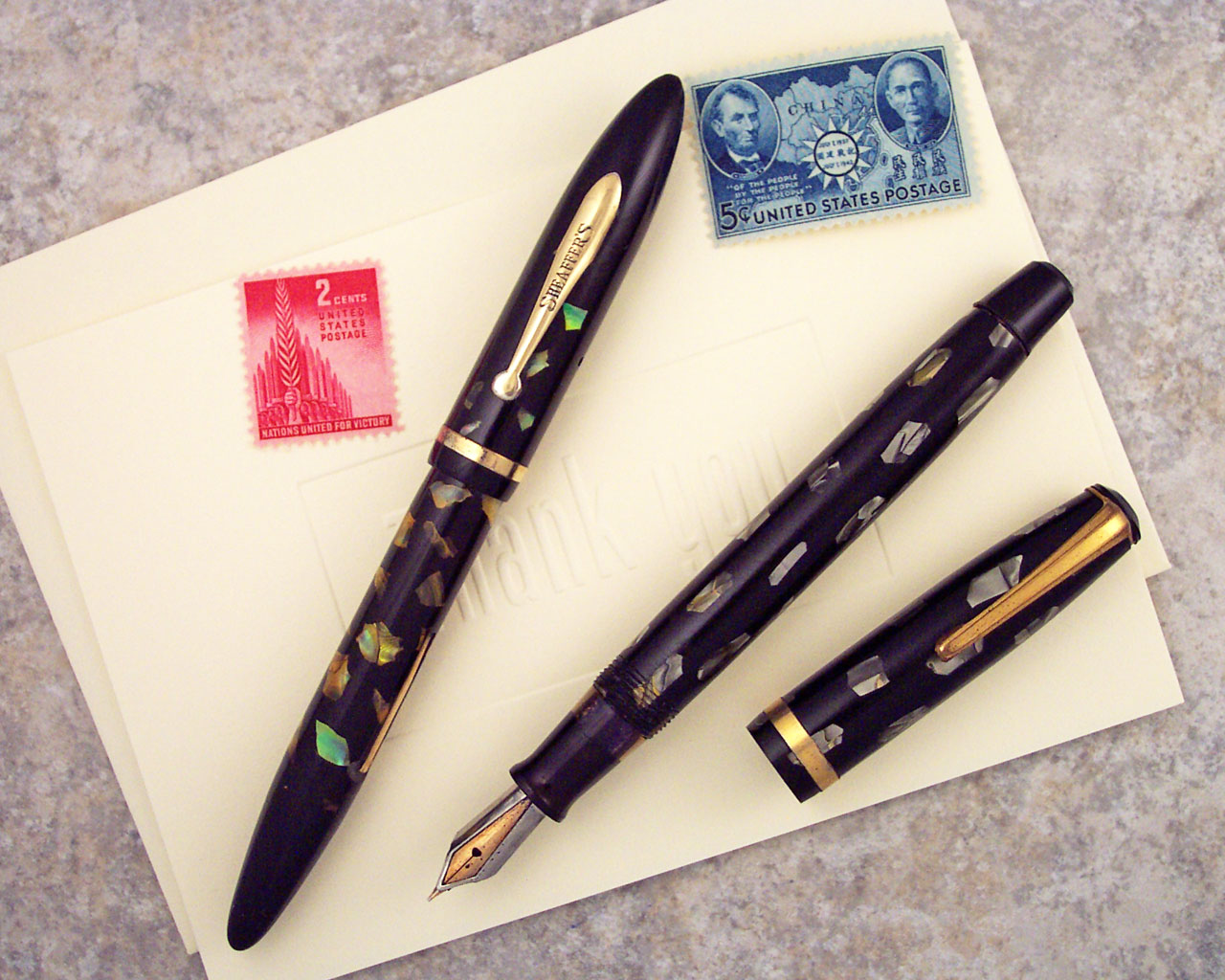
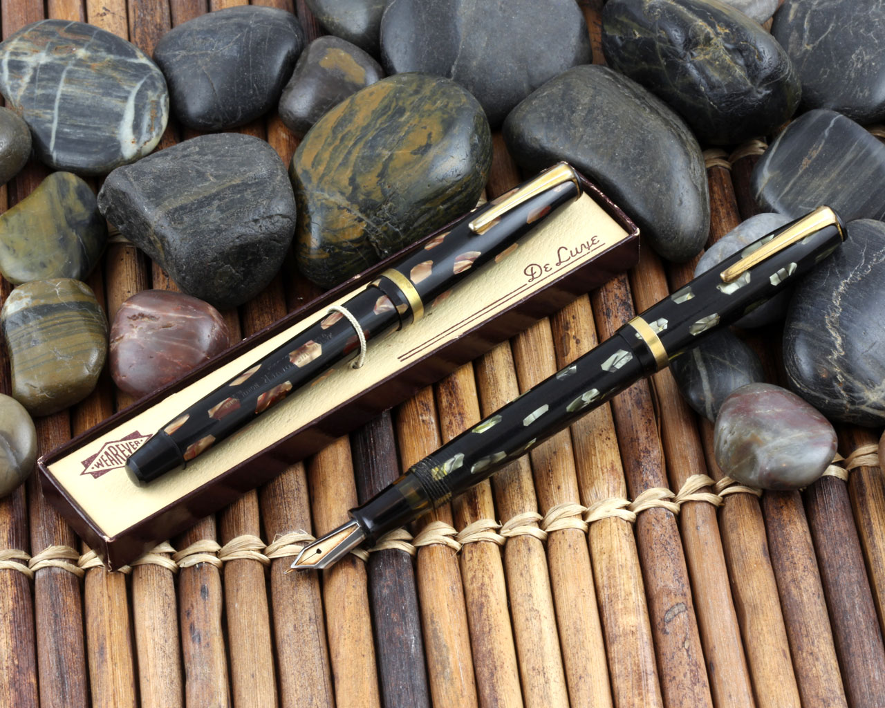 Wearever De Luxe "Mother of Pearl" pattern pens in brown and green pearl c1940-1945
A pearl of a Wearever
Every now and then a really interesting pen finds its way onto my worktable. It's unusual when that eye-catching pen is a Wearever. In this case, it was the "mother of pearl" inlay pattern in the black cap and barrel that caught my attention. It's reminiscent of one of my favorite pens, the Sheaffer Ebonized Pearl Balance pens made from 1934 to 1939. I found the green pearl pattern pen shown in this article in 2003 on a summer pen hunt. The brown pearl pen was picked up off eBay in 2016. I've often wondered about when these pens were made and the history of their features, and since I originally wrote this article in 2003, I've been able to gather a bit more information. There are still gaps to fill as to specific production dates, colors offered and model numbers. Wearever catalogs, advertisements, and dealer literature information from the 1930s and 1940s is very hard to find as many collectors pass over what is considered by many a third tier brand.
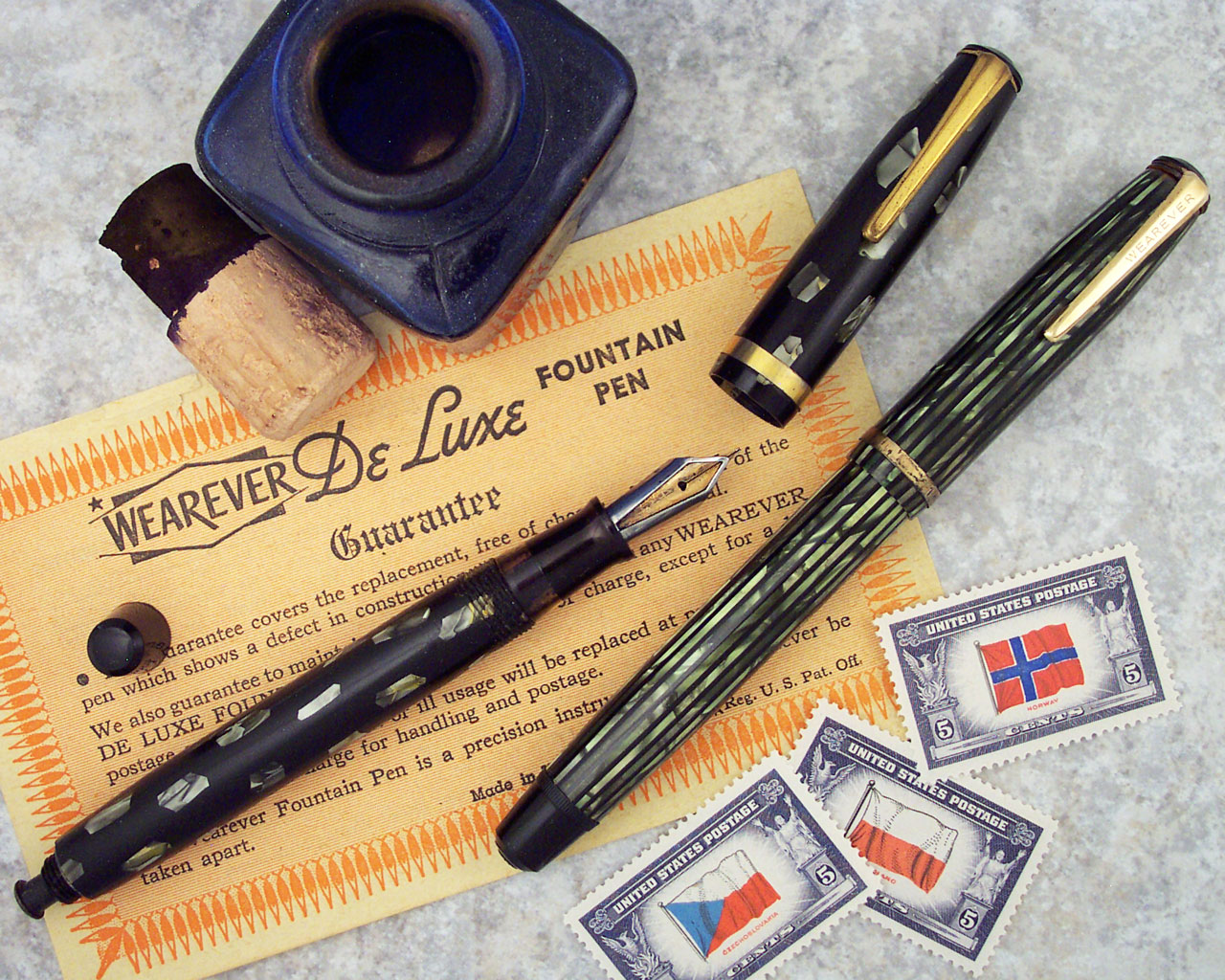
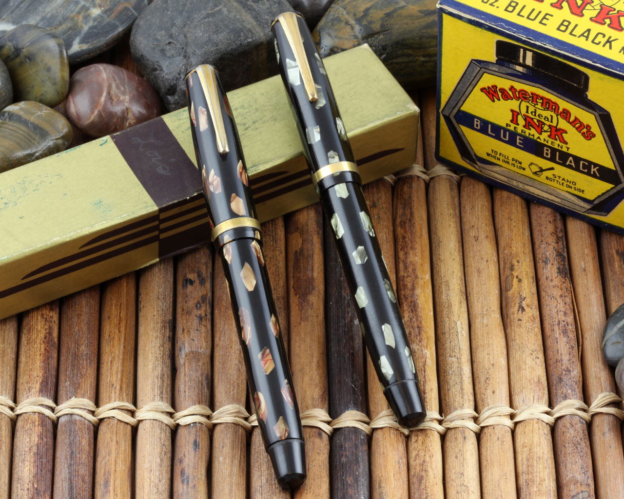 Wearever De Luxe "Mother of Pearl" pattern pens" brown pearl (left) and green pearl (right)
I admit a fondness for Wearever pens and acknowledge their many faults. David Kahn, Inc. proudly mass produced and heavily advertised Wearevers as affordable alternatives to the more expensive top tier brands. Wearever pens were made to be inexpensive and they show corner cutting to keep the price down, usually with US $1.00 or less as a target price point. This low cost focus results in quality compromises such as cheap plating, cheap materials, and inconsistent fit and finish, which decades later shows up as plating loss, shrinkage or warping, and loose fittings. Even mint or new old stock examples can show these problems. On the other hand, good condition examples can be easily restored and become rugged daily users with good to excellent writing nibs. David Kahn, Inc., the king of the dime store pens, was not making heirlooms but decent pens for budget conscious consumers.
In the wild, Wearevers are often found in the junk bin, often justifiably as many are in bad condition, carelessly mixed in bags or in boxes with other cheapies. Finding Wearevers that are workable, with a decent nib and filler parts may sometimes involve gathering several examples as parts donors. They are great pens for learning how to replace ink sacs, how to restore lever and button fillers, and how to set and smooth nibs. I personally re-sacced the green pearl pen shown in this article. It was very easy.
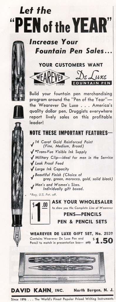 Wearever De Luxe 1942 advertisement showing the reinforced frame nib
This version of the Wearever De Luxe probably appeared no earlier than 1940, as it draws many design elements from the Parker striped Duofold button filler, made from 1940 to 1948. The De Luxe was also offered in a striped material, though different than Parker's, in gray, green, morocco and gold colors, as well as solid black. The washer clip is tapered like the Duofold, smooth faced, and is fixed in place with a flatter and wider black cap top jewel. The cap band is a plain, flat 1/8 inch gold tone ring. The button filler mechanism is very similar to Parker's, but the cover cap resembles the black valve stem caps on tires. The biggest departure from the Parker design is the nib unit, a massive metal frame that holds a small, thin 14 karat gold nib. Evidence is that Wearever ceased using this reinforced nib unit by 1944 as it is no longer shown in advertisements for pens with 14 karat gold nibs. These clues date this version of the De Luxe from c1940 to 1943.
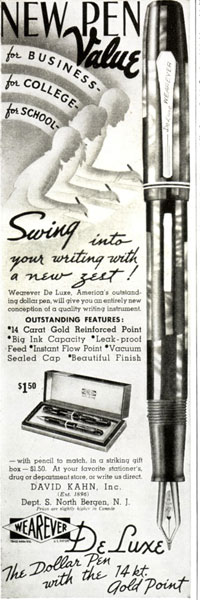 Wearever De Luxe 1938 advertisement showing the reinforced frame nib
The earlier, and possibly original De Luxe model appears to have been introduced in 1937. David Kahn, Inc. advertised the pen in 1937 and 1938. It's a distinctly late 1930s pen, with a tapered ended cylindrical shape and a front mounted clip on the cap. It does not appear in the 1936 Wearever pen catalog, which has the similar Pioneer as the flagship pen. The 1936 Pioneer "Dollar Pen" may be the first use of the newly patented 14 karat gold "reinforced point" that appears later on the De Luxe.
 Wearever De Luxe "Mother of Pearl" green pearl pattern pen alongside a Sheaffer Balance Ebonized Pearl
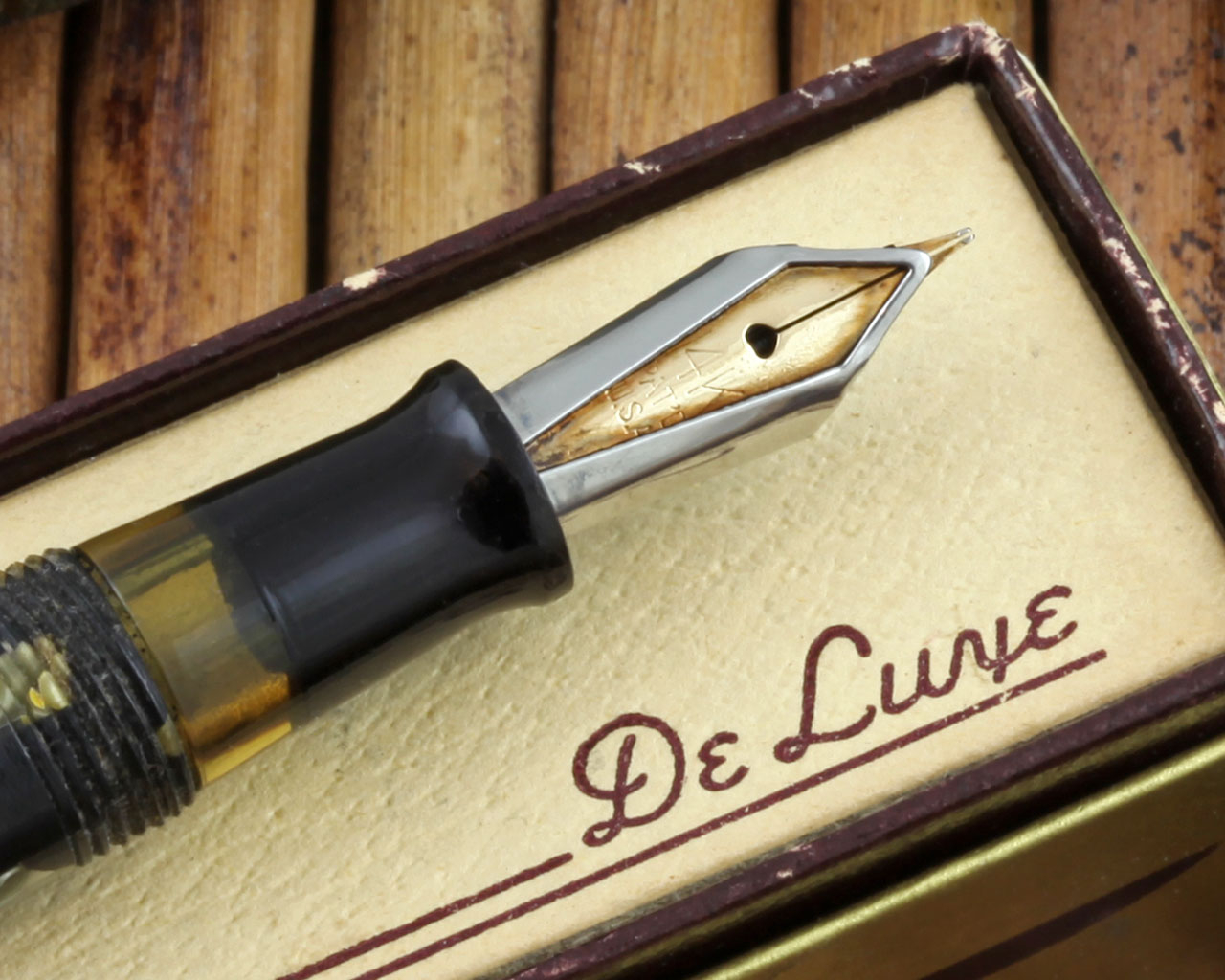
I'm calling the material on these De Luxe pens "mother of pearl" pattern as a descriptive name, lacking any catalog or advertising evidence showing color names or model numbers. The plastic is solid black and the "mother of pearl" bits do look similar to polished mother of pearl oyster shell inlays and appear to be molded into and through the plastic, as can be seen inside of the cap and cut through at the threads. I'm not sure this shade of green or brown exists in nature, though. The "mother of pearl" bits are translucent and vary without repetition on either of the two pens. Side by side, the pattern is a definite take on the Sheaffer Ebonized Pearl, though it's much more orderly. The "mother of pearl" bits are regularly spaced the entire length of the cap and barrel in a simple, diamond matrix. Looking carefully, the material shows a seam, indicating that it started out as flat sheets before being made into pen bodies.
 Wearever De Luxe "Mother of Pearl" green pearl pattern pen with blind cap removed, showing filler button
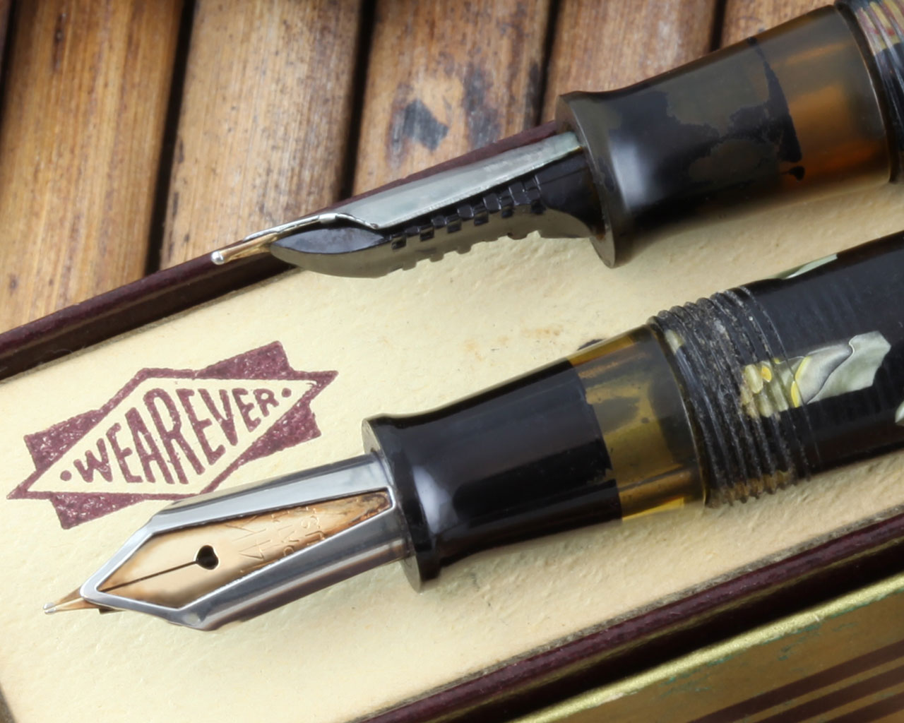
The pen has a blind cap covering a metal button filler, similar to the type in Parker button-fill pens, and which is upscale from the later Wearever Pacemaker's plain plastic button. The blind cap looks like it was derived from a tire valve stem cap design, and is not a flush fit with the barrel. The clip is plain, sculpted, and visually similar to the Parker striped Duofold clip. The imprint is the large three-part Wearever imprint, with "MADE IN USA" left, "WEAREVER" over "DE LUXE" center, in script, and "NORTH BERGEN N J" right. The section has a large visulated window to allow for quick checks of the ink remaining.
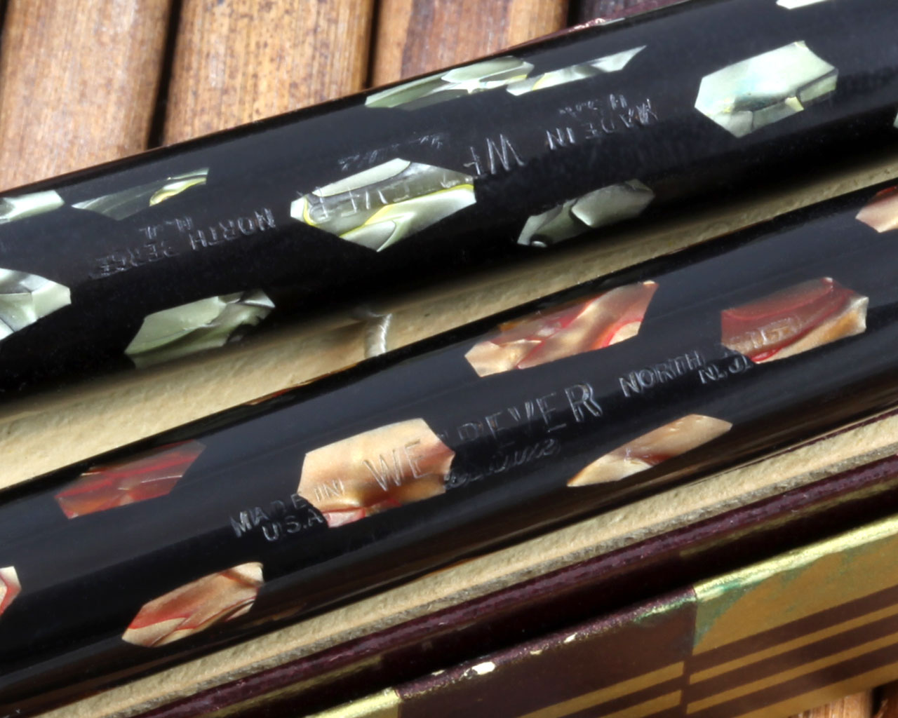 Wearever De Luxe "Mother of Pearl" pattern pens barrel imprint detail
Send in the reinforcements!
 Wearever De Luxe "Mother of Pearl" pattern pen nib detail
The first time I saw this nib unit, I did a double-take. I'm not sure there is anything similar to it. David Kahn, Inc. patented this design in 1935 as a way to offer a gold nib using less gold and still have enough strength and support for daily use. The solution was to make a nib shaped frame made of a corrosion resistant metal, probably stainless steel, that holds and strengthens the gold nib and fits in the section and onto the feed like a standard nib. This reinforcing frame has a cut out to show the gold nib and tabs at the front end that are bent under the face to hold the gold nib in place. The 1936 Wearever catalog shows pens with both 14 karat and 10 karat gold points using this design.
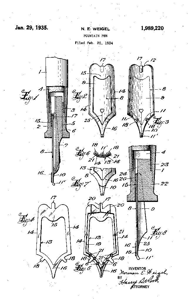 Wearever Patent US1989220 A, published January 29, 1935
The frame serves as a brace to reinforce what is probably a flimsy and smaller nib, definitely smaller than an open nib the size of the frame. The design allowed Wearever to use less 14 karat gold content probably with the objective of keeping the cost of the pen down so the pen could be sold for a dollar, and allowing Wearever to position the De Luxe as a well appointed low cost pen with a real gold nib.
 Wearever De Luxe "Mother of Pearl" pattern pen nib and feed detail
The frame design allows the nib to be flexible, even pleasantly soft, but the frame prevents the tines from spreading much, so the nib will not have the full line variation and vivid shading and expressiveness of a true flexible nib. It does have the soft feel of flex and allows a rather wet, even line.
This reinforced nib design may have saved money on gold, but by 1944, Wearever dropped it in favor of standard open 14 karat gold nibs.
From worst to first
Wearever was always promoted as offering a low-cost quality pen, priced lower than the market leaders, Parker, Sheaffer, and Eversharp. David Kahn, Inc. positioned the De Luxe as "The Dollar Pen with the 14 karat Gold Point!". The pen alone was US $1.00 and the pen and pencil set sold for US $1.50, available in a paperboard display type gift box. By 1945, Wearever broke through the $1.00 barrier with the Pacemaker, retailing for US $2.75 and fitted with a full 14 karat gold open nib. Better materials and strong sales allowed Wearever to approach the pricing of the major brands secondary lines. Wearever advertisements in the late 1940s declared David Kahn, Inc. as "America's Largest Fountain Pen Manufacturer", a true statement from the volume leader, built largely on the success of inexpensive mass market pens like these early De Luxe models.
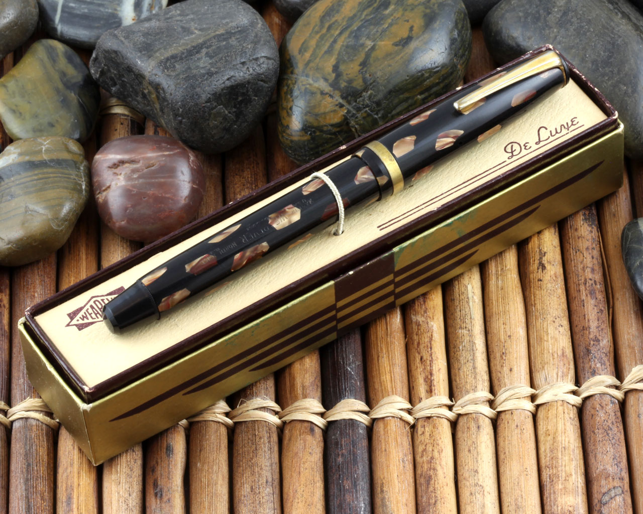 Wearever De Luxe "Mother of Pearl" brown pearl pattern pen with display gift box
Identification guide and features:
There is limited catalog, price list, and advertising information on the Wearever De Luxe pen models dating from 1937 through 1942. The patent date for the unique reinforced nib unit is 1935 and it shows on select Pioneer models in the 1936 catalog. I've not been able to identify and confirm this specific model and color's dates and pricing. Wearever changed the design of the De Luxe line some time between 1938 and 1942 as evidenced by the March, 1942 advertisement in American Druggist showing the De Luxe with the same cap, clip, barrel and filler design as these "Mother of Pearl" pens. Later advertisements, starting in 1944, no longer show the reinforced nib unit. Considering that the Parker striped Duofold button filler pens were introduced in 1940, the widest date range for this version of the De Luxe would be 1940 to 1943.
- Cap and barrel made from black plastic with "mother of pearl" inlay design
- Color examples have brown and green inlays, other colors may have been available
- Gold tone trim
- Tapered washer clip
- Black plastic cap top jewel
- "Trans-Vue" section, with ink view window
- 14 karat gold nib marked "14K" over "PAT'D" over "U.S.A." mounted in white metal reinforcement frame
- Fine, Medium or Broad nib
- 5 1/4 inches long capped, 6 1/8 inches long with the cap posted on the end of the barrel
- Button-fill mechanism
- Black button fill cap
- Sold in paperboard boxes
- Retail price was US $1.00, US $1.50 with matching pencil
Performance
I tested the green pearl Wearever De Luxe "Mother of Pearl" pen. I had to re-sac it as the original sac was very hard and unusable. The section is a friction fit and pulls straight out. The section nipple has grooves and it's easy to slip on a new sac and put the pen back together.
The nib is a very soft and very wet writing medium. It writes quite nicely, with some line variation coming more from the softness than to any tine splitting as on a true flexible nib. I find it nice to write with, but a little too wet for porous paper. The button filler works very well, jetting out a lot of liquid when flushed, better than most Pacemakers, and has more of a quality, "Parker" feel. This could be a sample quality, but I now have more examples of De Luxe pens, and they seem to have a better filler mechanism.
 Wearever De Luxe "Mother of Pearl" green pearl pattern (left) and Wearever Pacemaker Green Stripe (right) c1940-1950
The De Luxe is the same basic size and shape as the later Pacemaker, about 5 1/4 inches long capped and 6 1/8 inches posted. It's very lightweight, and the cap adds very little weight when posted. It posts securely. It's nicely balanced, capped or posted, but I prefer posted.
The "mother of pearl" plastic is very attractive, but the orderly pattern has only a little depth and is less visually interesting than the Sheaffer Balance Ebonized Pearl. No surprise as the Sheaffer is a much more expensive pen. The chips look molded in, not as if they were dropped into the pen's plastic, as if suspended in amber. The material is a bit duller than the Sheaffer or Parker plastics.
The fit and finish is good, somewhat better than the later Pacemaker, but definitely not in the same class with the Parker striped Duofold. The clip and cap ring show typical Wearever plating loss. The plating on these pens is a wash on, rather than real gold fill, and wears off easily. Completely brassed pens are not uncommon.
The clip has a little give, but not enough for really thick material. It was advertised as a "military clip" and the pen does sit low in the pocket, military style.
This was a very fun pen to try out. It's got more curb appeal than most Wearevers, though it does not rise far above them in quality. The nib is a treat to write with, but the frame inhibits any true flex, resulting in a nice soft writer, but no real expressiveness.
The good thing about collecting Wearevers is they're generally not expensive. The fun is that every now and then you'll turn up a pearl.
Acknowledgement
Thanks to Frank Dubiel for his personal and publicly posted information on Wearever pens and identifying the reinforced nib unit.
Thanks to John Cutcher for the 1938 Wearever advertisement scan.
Thanks to retrospace.org for the 1942 Wearever advertisement scan.
References
Parker Duofold, David Shepherd and Dan Zazove, Surrenden Pens Limited, Brighton, U.K., 2006
PenCraft Wholesale Catalog, Boston, Massachusetts, USA, 1937
US Patent 1989220, Publication date January 29, 1935
Wearever Catalog, David Kahn, Inc, North Bergen, New Jersey, USA, 1936
Wearever advertisement, Life, October 11, 1937
Wearever advertisement, Life, November 8, 1937
Wearever advertisement, Life, December 6, 1937
Wearever advertisement, Saturday Evening Post, 1938
Wearever advertisement, American Druggist, March, 1942
Interact
Comments on this article may be sent to the author, Jim Mamoulides
Pen Clubs
PenHero on Social Media
Pen Forums
![]()
![]()